Microsoft Outlook 2013 email software

Email software is mostly just that – it handles your email, but of course with email comes the need for other features that are not so instantly obvious if you’re new to email. For example, you need a contact management system to store all your email addresses. With that, you need more than just the email addresses, so telephone numbers, postal addresses and other personal details such as birthdays and spouses names. That’s more-or-less now standard across all email packages.
As with previous versions of Outlook, if you are working in a corporate environment, then your email is almost certainly coming to you through a company email server. That email server is probably running Microsoft Exchange. Outlook 2013 integrates seamlessly with Microsoft Exchange. And so there you have it – the industry standard.
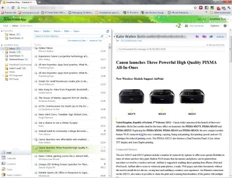
Outlook 2013 is the first touch-orientated version of Outlook, having been designed for Windows 8. In many ways, it’s great – all the touch functionality (see detailed reviews elsewhere) is really well thought out, but it’s not without its faults. Of course, it contains almost all the same features contained in previous versions, but the elegance of greater on screen efficiency has been well thought through. There’s a bunch of automated or semi-automated features, such as recognising and linking contacts which work well. Critics complain about some features however: you can’t drag and drop emails into the calendar to make an appointment any more. If you get more than one email in a single download, then instead of ‘landing’ one on top of the other, they land one above the other, thus obliterating that part of the screen. Oh, and you can’t delete or accept a meeting request from the new pop-ups either. There’s a ‘Suggest Replacement’ app that allows you to add meeting details from an email to the calendar, but only if you are interfacing with Microsoft Exchange 2013.
To do it justice, you really need to play with Outlook 2013, but to summarise it, it is ‘Outlook for Windows Phone’. This gives it a great clean, uncluttered look, but loses some useful functionality along the way.
To go to the Outlook website, click here.
Outlook 2013 Settings for Net2Air
Coming soon…

